As the 12th Global Forum for Hunan Entrepreneurs approaches, the conference's official logo has been finalized. In a recent interview, designer Peng Xin gave reporters an early look at the cultural meaning and creative thinking behind this visual symbol.
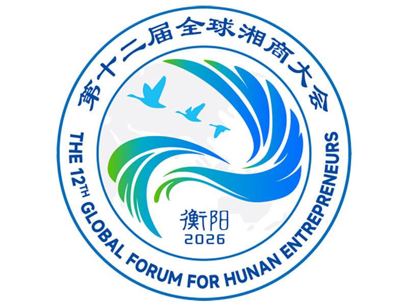
“When we took on the design task, we knew this was more than a logo. It is a visual invitation extended by Hengyang and by Hunan Province to Hunan entrepreneurs around the world,” Peng said. Her team set the direction from the very beginning: wild geese as the bond, Hunan as the root, the world as the horizon. Two questions had to be answered: how to convey the conference’s international vision and openness, and how to root the design in Hengyang's identity as the “Wild Goose City” and create a distinctive local imprint. The team first studied in depth the legends behind Hengyang’s goose-city heritage and the cultural connotations of sanxiang sishui — Hunan’s “three Xiang regions and four rivers.” They eventually made the wild goose the central thread linking a sense of local belonging with a global outlook, producing a visual symbol that combines international appeal with a distinctive Hunan signature.
A closer look at the logo shows flowing, streamlined forms in a blue-green gradient — at once an impressionistic rendering of a wild goose in flight and an allusion to Hunan's rivers and landscape. Multiple lines converge toward the center, symbolizing Hunan entrepreneurs worldwide resonating in unison and pooling their strength. Against a faint world map in the background, three birds fly forward in formation, echoing the Wild Goose City culture and signifying Hunan entrepreneurs crossing mountains and seas with their hearts set on home.
Peng admitted that this “one form, multiple meanings” symbol went through many rounds of refinement. The team weighed repeatedly the degree of graphic concreteness, recognizability and overall impact, and gradually evolved a single goose shape into a structure integrating multiple layers of meaning — one that retains the liveliness of birds in flight while giving the conference a sense of dignity, modernity and technological sophistication.
The choice of a blue-green gradient is equally deliberate. Blue stands for openness, technology and a global vision; green represents Hunan's landscapes and vitality. Together, they convey an upward-growing momentum that fits closely with the conference's theme of openness, cooperation and win-win development.
“The one message we most want to convey is: wild geese return to Hunan; together we shape the future,” Peng said. In her view, the returning goose and Hunan entrepreneurs share the same spiritual core: heading for distant places while never forgetting where they come from. She hopes Hunan entrepreneurs at home and abroad will read from this logo an open, confident and dynamic Hunan, and understand the community’s loyalty, fellow feeling and attachment to their hometown.
As the conference’s visual calling card, the logo carries the hope of connecting hometown ties and pooling strength. Peng said she looks forward to it becoming an important symbol of Hunan’s image, helping Hunan entrepreneurs worldwide gather, get to know one another and move forward together, and injecting fresh momentum into the province’s high-quality development.